

Planet3 RMS Charger Details - UX Case Study: turning complex charger behavior into a simple decision-support screen.
Overview
This case study focuses on the Charger Details experience in the Planet3 Remote Management System, created from scratch to help teams monitor and manage EV chargers with clarity. The goal was to create a practical, user-friendly experience for operations teams, service teams, site managers, and business stakeholders. Instead of simply displaying data, the product explains condition and highlights next actions.
Timeline
2023 - 2024
Role
Business Analyst & Product Owner
Platform
Web Application
Tech Stack
The Impact
Decision Focus
Designed the experience around actionable insights rather than raw data.
Overview Priority
Placed key health indicators at the top for immediate understanding.
Mental Model
Separated charger-level from connector-level information.
The Problem
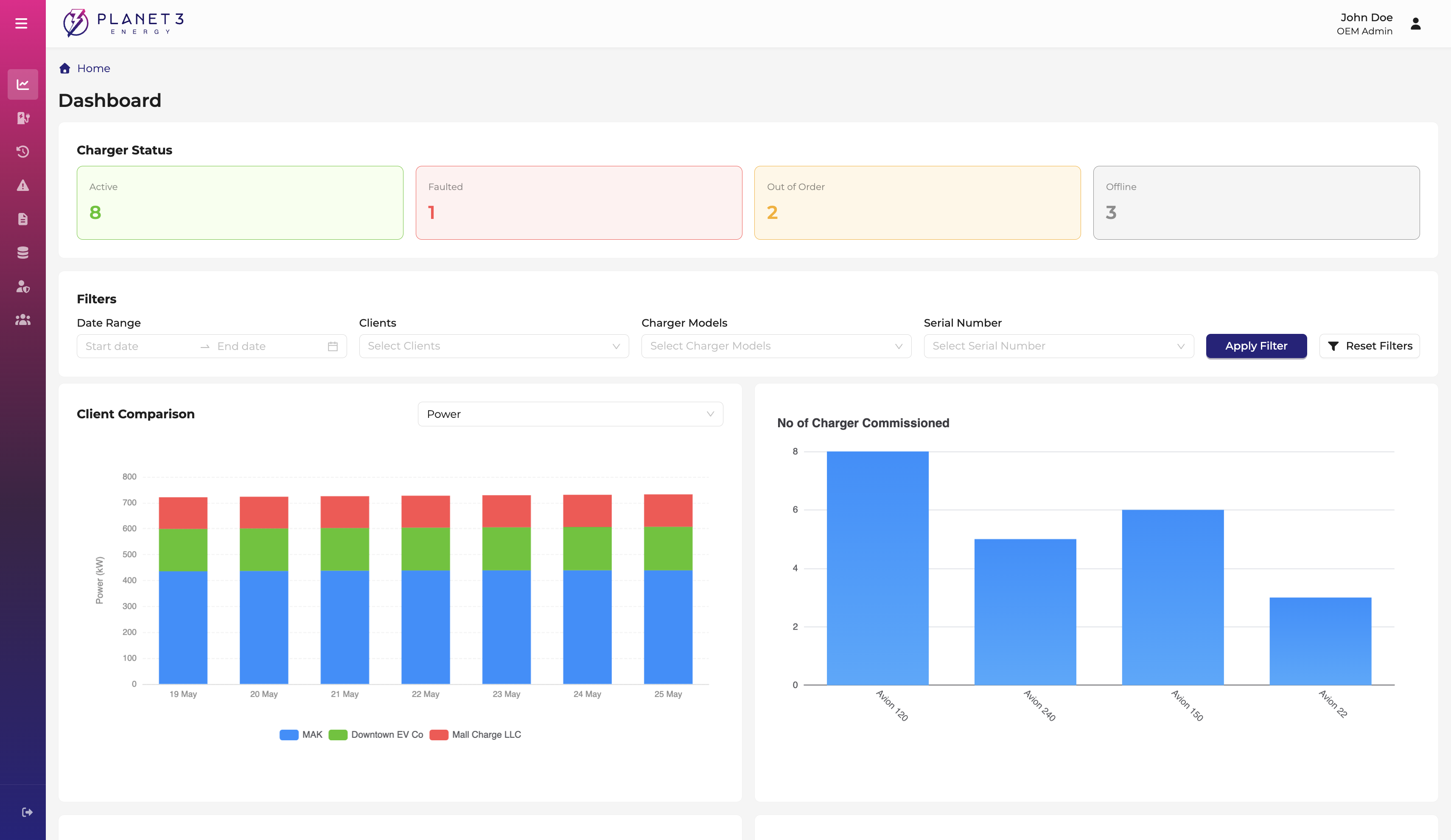
An EV charger produces live status, connector availability, sessions, alerts, and maintenance needs. The biggest challenge was organizing this into a clear, usable product experience.
The Process & Operational Reality
As a BA and Product Owner, I bridged the gap between how the charger communicates with the system and how users expect to experience that information.
Operations Teams
Operations teams need a quick understanding of whether the charger is working well or needs attention:
- Requires overview-first experience to assess overall health.
- Needs to identify faults, warnings, and service needs immediately.
- Benefits from simple status language without deep technical detail.
Service Teams
Service teams need to understand exactly what is failing and why. The experience supports deeper troubleshooting:
- Separates charger health from connector-level performance.
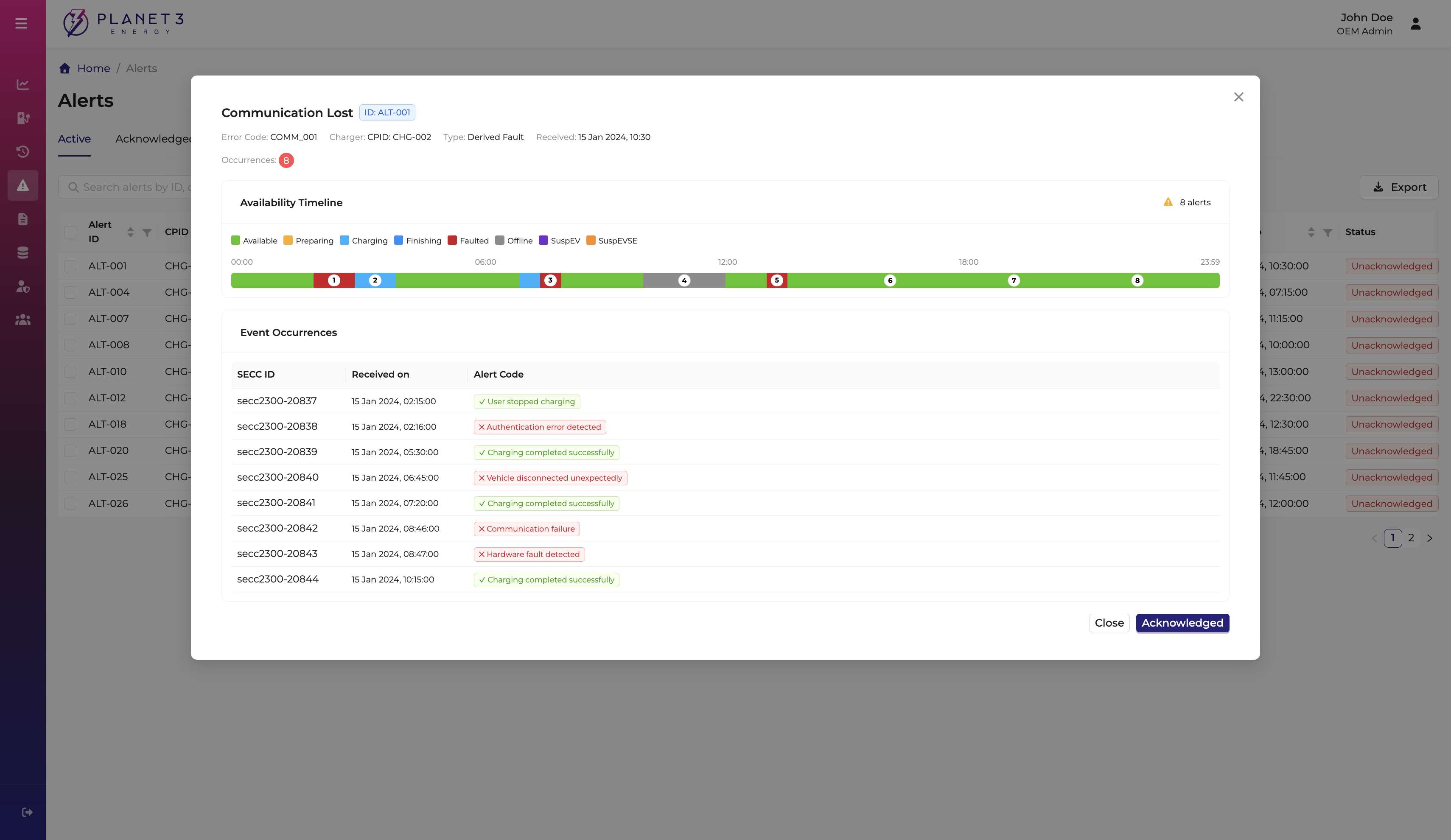
- Groups sessions, alerts, and maintenance to support workflows.
- Creates a clear flow from 'What is happening?' to 'What should I check next?'
The Solution
A comprehensive deep dive into the operational breakthroughs engineered to bring low-cognitive friction, verified security, and seamless ease.
Problem Tackled
Prioritizing key health indicators
Overview-First Experience
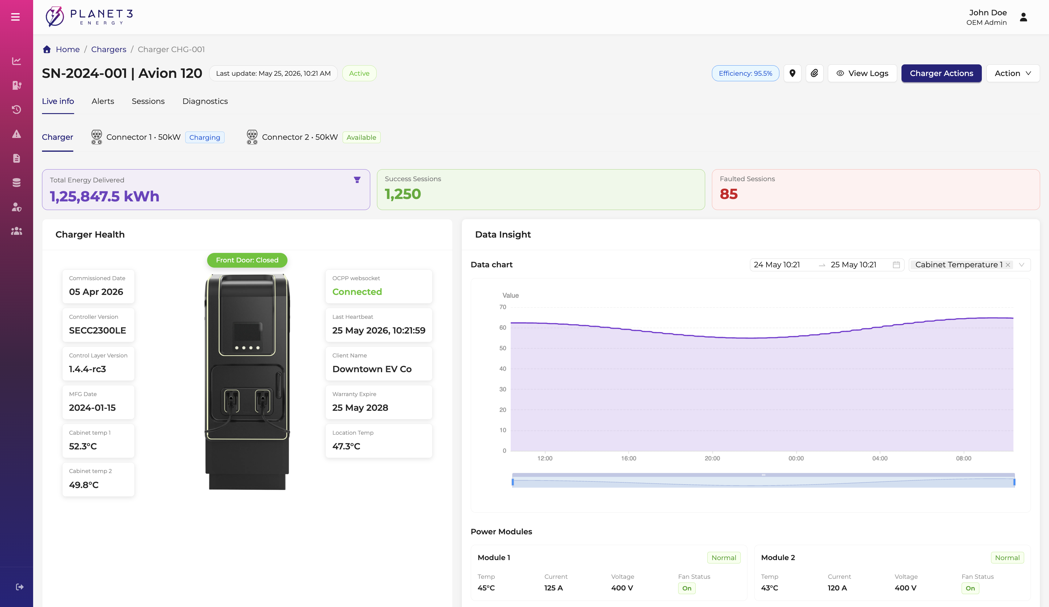
The experience starts with the most important information: energy delivered, successful sessions, faulted sessions, charger health, connection status, and service details.
Problem Tackled
Contextualizing the physical charger
Visual Health View
Important details are placed around the charger image. This helps users connect information to the physical charger and makes the experience much easier to scan.
Problem Tackled
Charger vs. Connector Information
Separating Contexts
Separating charger-level information (overall machine) from connector-level information (individual ports) creates a clearer mental model and reduces confusion.
Learnings
"A strong product experience starts with understanding the system, but becomes valuable only when translated into a clear user journey."
By defining the experience from a product owner perspective, the page became more than a data view. It became a decision-support screen that guides meaningful action.
Product clarity begins with system behavior
Learning how the charger communicates helped define what users should see.
Prioritize user needs over available data
A Product Owner needs to prioritize what users need first, not just what data is available.
Let's craft the next operational breakthrough.
Have a complex transactional workflow, multi-role portal, or data-dense dashboard to design?